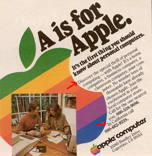
Introduction
This advertisement was found from another blog. I could not however, find where the original blog poster found the ad. I would assume that this specific advertisement was worked on by Jeep’s team of designers. This design challenges the audience to take on anything nature throws our way. With that invitation, here we go!
Original Advertisement Post
Contrast

There are several different uses of contrast in this design. Lets start off with the most noticable, the yellow Jeep. The bright color of the Jeep, makes the Jeep the first thing that stands out. The use of the color yellow, against the white snow, again draws in the eyes of the viewer. Next, the contrast in the text. The first two lines of the text is in bold and is larger when compared to the next two lines, which are in contrast, a thinner and smaller text. It then goes on to finish the words with the Jeep logo in a larger text and in bold. This use of contrast in the text, draws our eyes in. The contrast forces us to read, “Take on anything nature throws your way…Jeep” and if we are really interested we can focue our eyes to the middle of the text. We also see the Winter X Games logo in the corner, using blue and black, which strongly contrasts against the white of the snow. That contrast, pulls our eyes and we are able to recognize that Jeep is a sponsor of the games. Lastly, in regards to contrast, the left corner of the design is significantly darker, compared to the right corner of the design. Now this could be to exemplify how the Jeep is the one monster who really brings the storm, which is very ironic because the Jeep is heading straight towards the avalanche, which is the actual storm. The contrast of light and dark connects to the challenge, Jeep can take on anything.
Repetition

The repetition of the white snow and the white words work together to make the whole design have a clean and organized feel to it, even though the concept of an avalanche ia a bit chaotic. The repetition of the bold text makes the design unified and more visual appealing. Another example of repetition in this piece is the shadows being cast on the snow, I think the shadows show us that the Jeep is going uphill, bringing the “storm” with him.
Alignment

The alignment of this piece is spot on. The text in the top left corner is perfectly left flushed. The Winter X Games logo is perfectly aligned as well. Another interesting point of alignment is the alignment of the side of the hill, to the top of the Jeep, to the second shadow on the hill, to the tire indentations behind the Jeep as well as the bottom of the Jeep. These elements of alignment groups the design together, extends the proximity of the piece, and adds to the viual appeal and effectiveness.
Proximity

The Proximity of the text groups the slogan to the Jeep logo. From looking at it, we have no doubt that they are supposed to be connected and therefore read together. The other huge element of proximity in this piece is how close the front end of the Jeep is to the avalanche. The closeness of the two show us that they are connected. It also makes sense because the text says that Jeep can face anything nature throws our way, in this case that is a huge avalanche. When I first looked at the add I thought to myself, “Is the Avalanche going towards the Jeep or is the Jeep going towards the Avalanche”. Obviously, because of the proximity of the front end to the avalanche, it is the later option. If it was the other way around, and the back was in proximity to the avanlanche, I would say the Jeep was driving away from the avalanche. However, because of this specific use of proximity we have no doubt that the Jeep has the power to take on the avalanche.
Color
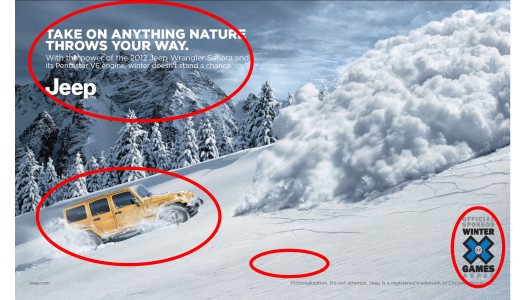
The use of the white creates a very immense, clean, and organized feeling. The use of the yellow Jeep was a perfct way to point out our point of interest. Not only was yellow a pop out color, but yellow is a color of happiness, joy, and optimism. I think the designers used yellow to show and simulate the joy and fun that can come from owning a Jeep. The use of the white text against the dark grey sky and mountains creates contrast and draws our eyes in. Lastly, the use of the black and blue Winter X Games logo is really the only other use of a bright color, besides the white. Again, I think this is so that the logo is able to stand out against the white.
Conclusion
Every single one of these principles work togther to successfullyand effectively relay the overall design and message of the piece. The principles were able to complement each other quite perfectly. However, I do think that the contrast of this piece was the most effective. Without it, I feel like certain aspects of the design would be lost. I feel like the visul appeal and the organization of all the different principles screams that owning a Jeep is a blast and it can do things that no other vehicle can do!